SHP
Aug. 2017 – Dec. 2017
SHP
Aug. 2017 – Dec. 2017

Mobile App
Launched in Korea
Seoul Information Design Lab
Mobile App
Launched in Korea
Seoul Information Design Lab
Mobile App
Launched in Korea
Seoul Information Design Lab
EN
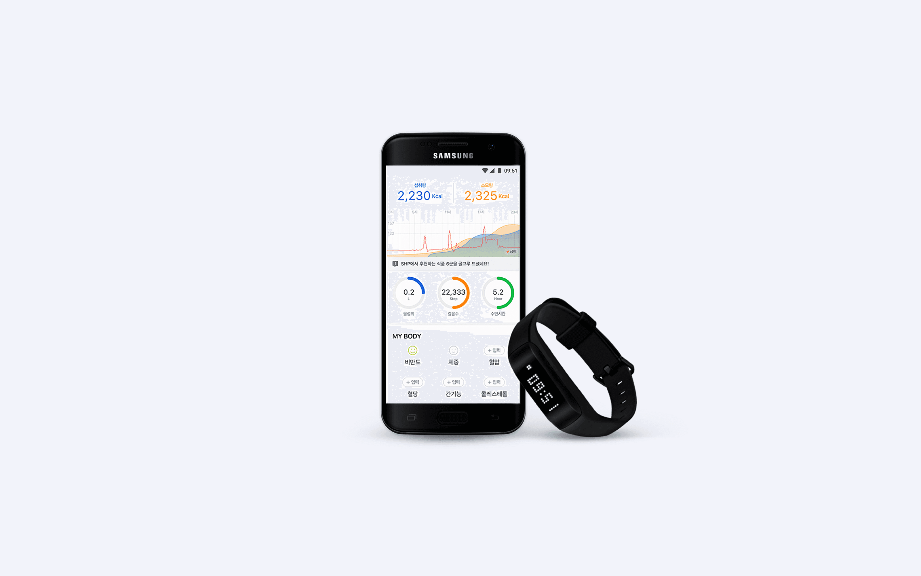
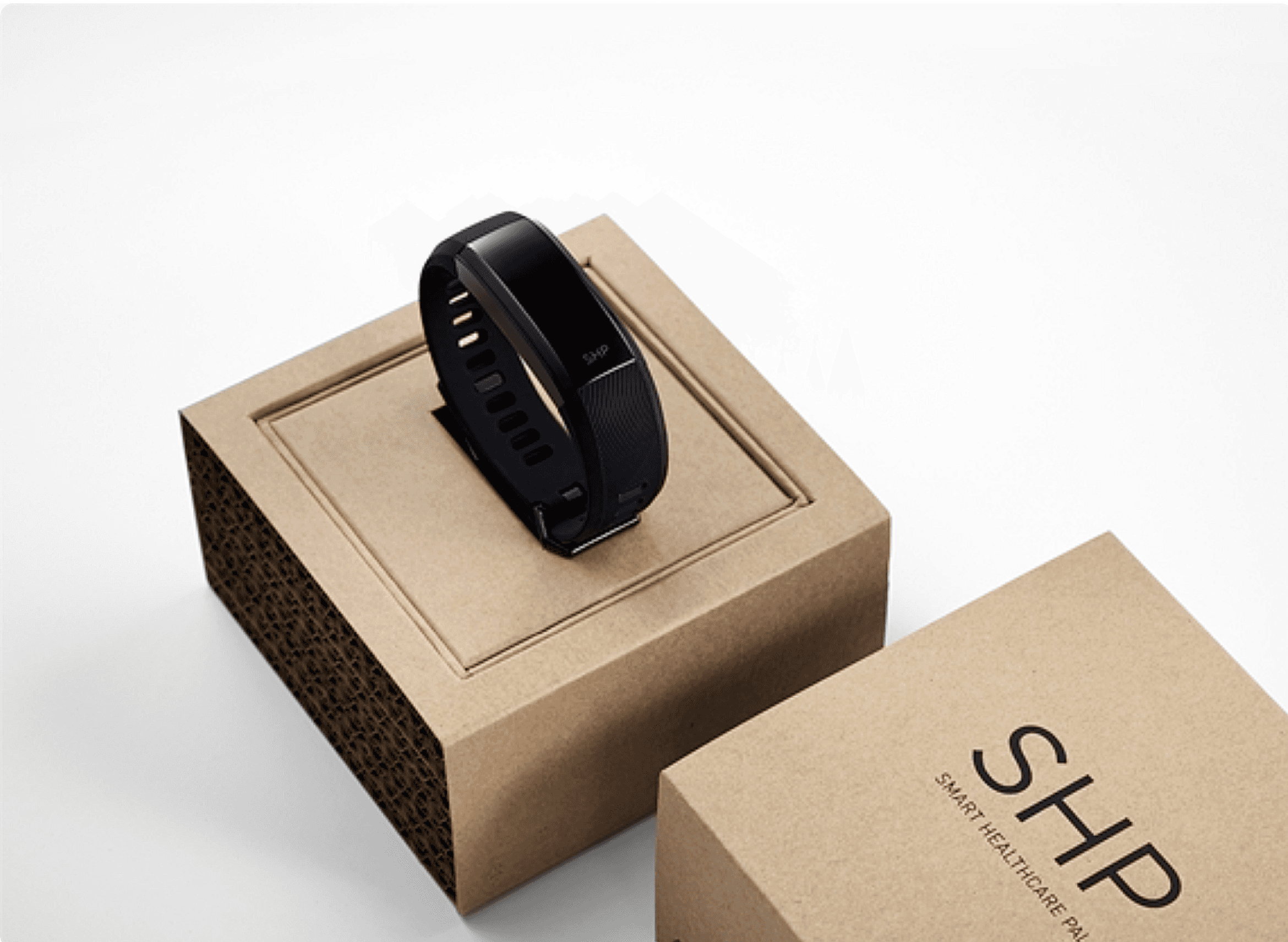
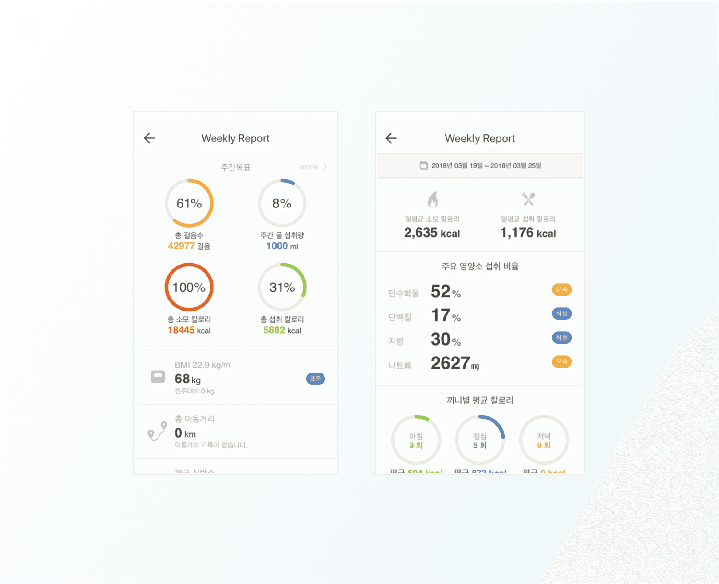
SHP is a mobile healthcare app designed to make health management easy, personalized, and engaging for employees of Samsung Group companies. By connecting with affiliated fitness centers and clinics, users can monitor their health in real time. Based on personal health data, SHP offers tailored diet and exercise recommendations, while also allowing users to track calorie intake and activity in an intuitive and efficient way. The SHP-exclusive wearable band automatically collects data such as steps, heart rate, sleep duration, and calories burned. It syncs with the app to eliminate the need for manual input, helping users stay informed with minimal effort. Weekly health reports offer personalized feedback, including nutritional breakdowns and activity summaries, empowering users to manage their health more proactively.
Role
As a UX/UI designer at the Seoul Institute of Information Design, I worked on the redesign of SHP 2.0 and 3.0, commissioned by Hotel Shilla and Samsung Welstory. My responsibilities included enhancing the usability of the existing app through improved information structure, as well as designing a consistent interface and establishing design systems and guidelines. I collaborated with developers and client teams to ensure clear communication and alignment throughout the design process. Redesigned core screens to improve clarity and navigation within the app. Created a scalable design system to support consistency across versions 2.0 and 3.0.

Before & After: Key UX/UI Improvements in SHP 2.0
Before & After: Key UX/UI Improvements in SHP 2.0
Usefulness
Usefulness
Before
Before
The original design included a wide range of features, but the layout was cluttered and poorly organized, making navigation challenging.
The original design included a wide range of features, but the layout was cluttered and poorly organized, making navigation challenging.
After
After
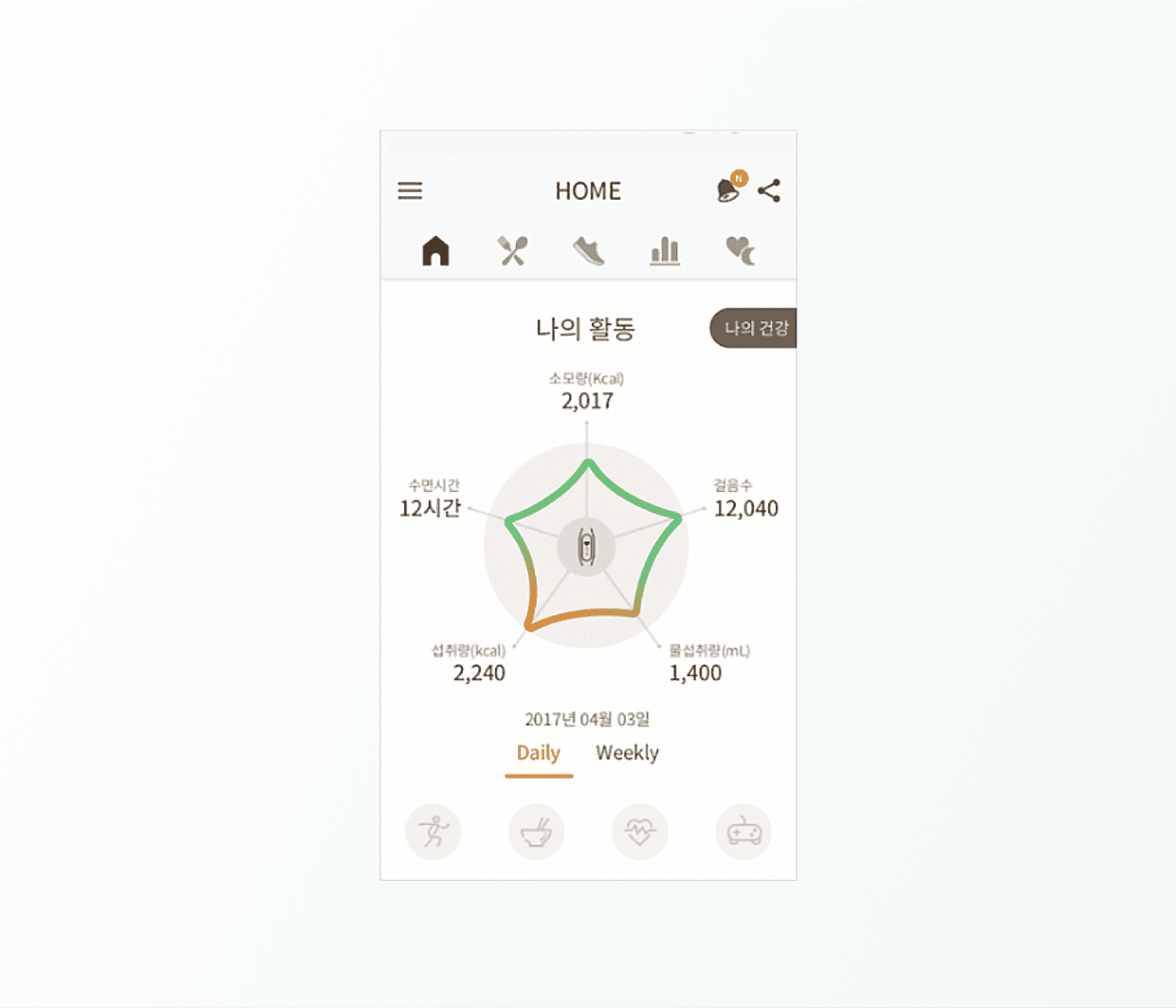
The redesigned layout focuses on clarity and essential information. Key health data, such as calorie tracking, is now presented through simplified visuals that allow users to quickly grasp their status at a glance.
The redesigned layout focuses on clarity and essential information. Key health data, such as calorie tracking, is now presented through simplified visuals that allow users to quickly grasp their status at a glance.
Usability
Usability
Before
Before
The menu structure was overly complex, with repetitive content that made it difficult for users to find what they needed.
The menu structure was overly complex, with repetitive content that made it difficult for users to find what they needed.
After
After
Navigation has been streamlined through a simplified menu structure and reorganized IA. Redundant content was removed, and high-priority features were brought forward to improve accessibility and flow.
Navigation has been streamlined through a simplified menu structure and reorganized IA. Redundant content was removed, and high-priority features were brought forward to improve accessibility and flow.
Data Visualization
Data Visualization
Before
Before
Dense and complicated charts made it difficult for users to interpret their health data effectively.
Dense and complicated charts made it difficult for users to interpret their health data effectively.
After
After
Data visualizations were redesigned to be more user-friendly and easier to read. Graphs showing calorie intake and expenditure now highlight usage patterns clearly, making it easier for users to interpret and act on the information.
Data visualizations were redesigned to be more user-friendly and easier to read. Graphs showing calorie intake and expenditure now highlight usage patterns clearly, making it easier for users to interpret and act on the information.
UI/GUI Simplification
UI/GUI Simplification
Before
Before
The interface was overloaded with information, resulting in poor readability and visual fatigue.
The interface was overloaded with information, resulting in poor readability and visual fatigue.
After
After
The new UI adopts a clear grid-based layout and color-coded elements to improve legibility and highlight health status more effectively. Unnecessary text and screens were reduced or consolidated, resulting in a cleaner, more engaging interface that enhances the overall user experience.
The new UI adopts a clear grid-based layout and color-coded elements to improve legibility and highlight health status more effectively. Unnecessary text and screens were reduced or consolidated, resulting in a cleaner, more engaging interface that enhances the overall user experience.
Initial

Redesigned
A
B
C

D

E


F

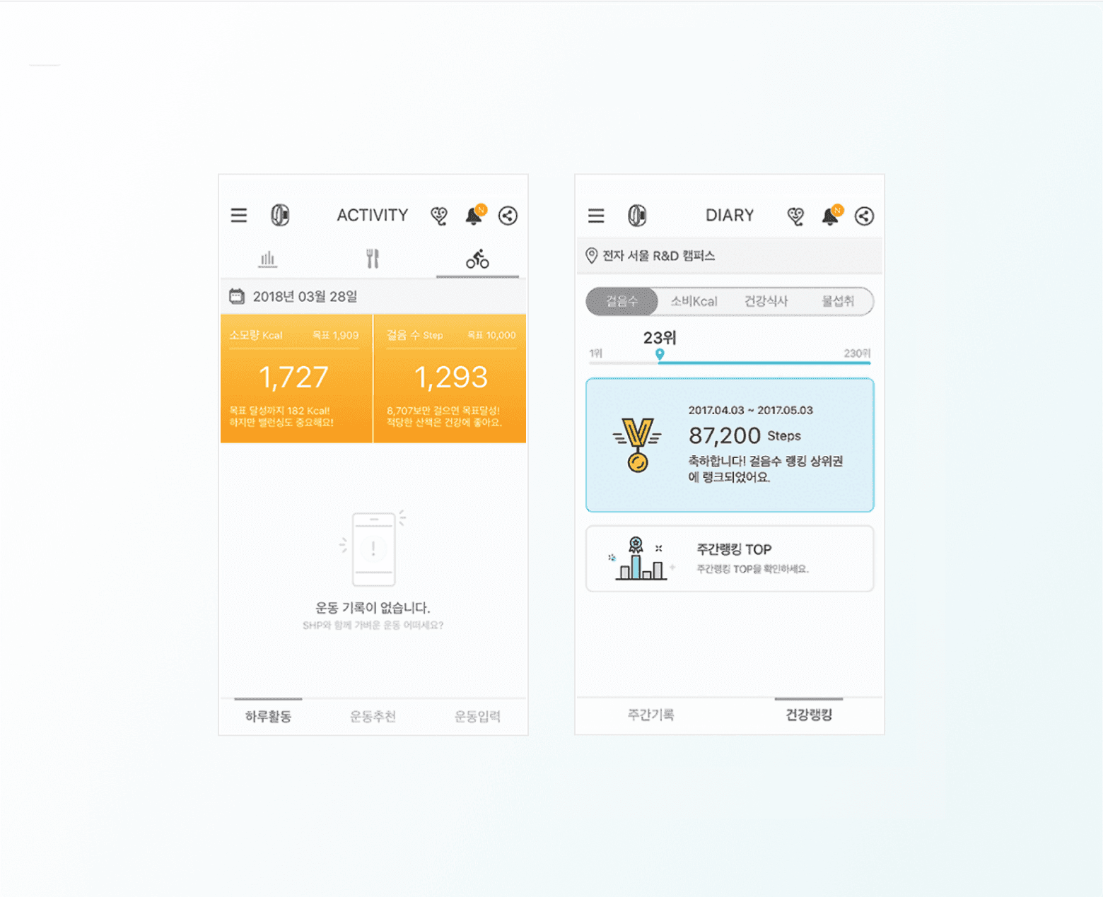
A
Activity & Diary
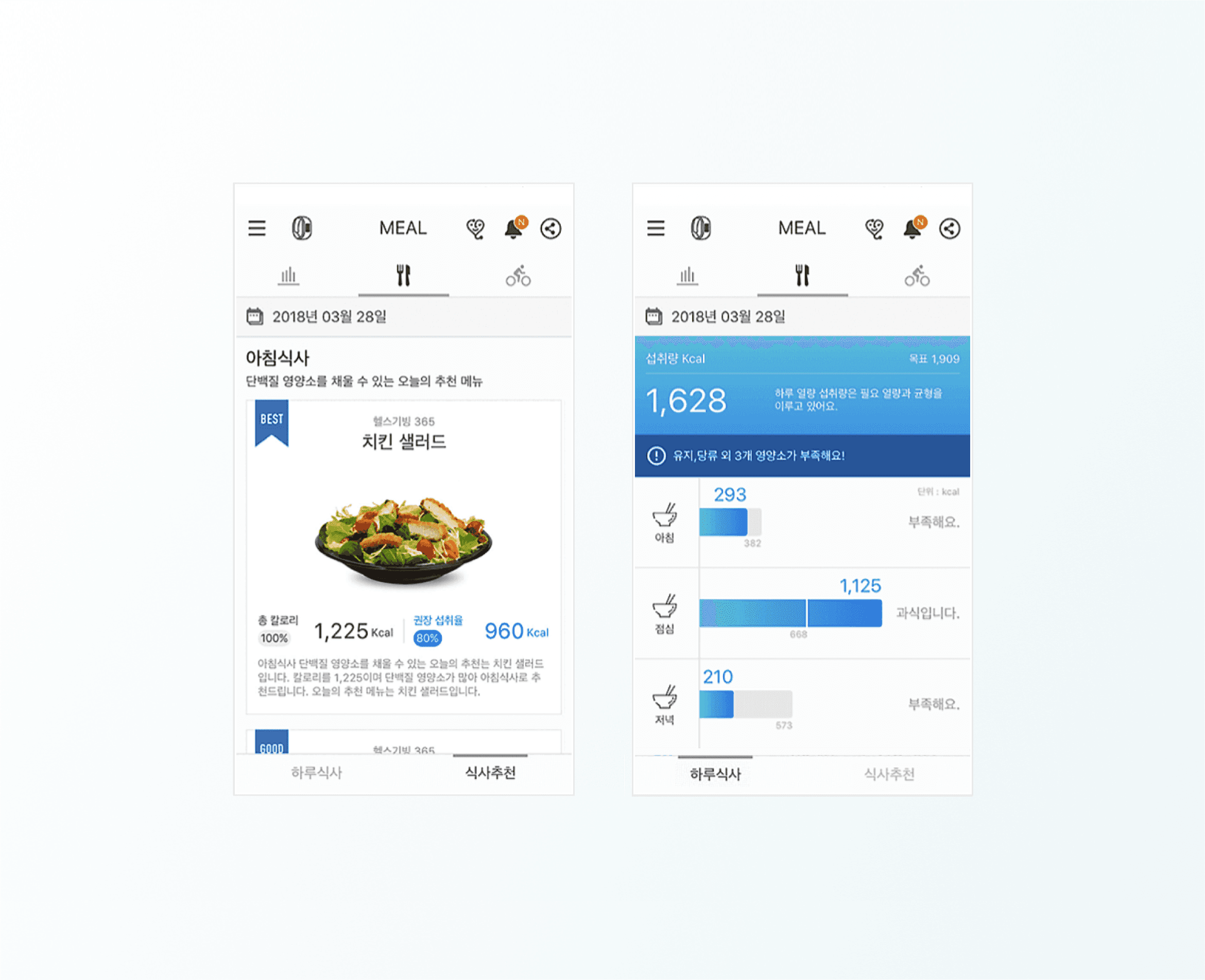
B
Meal
C
Weekly report
D
Colors
E
Typography
F
SHP 3.0
Selected images sourced from:
Selected images sourced from:

