Naver Music
Naver Music
May. 2017 – Jun. 2017
Naver Music
May. 2017 – Jun. 2017
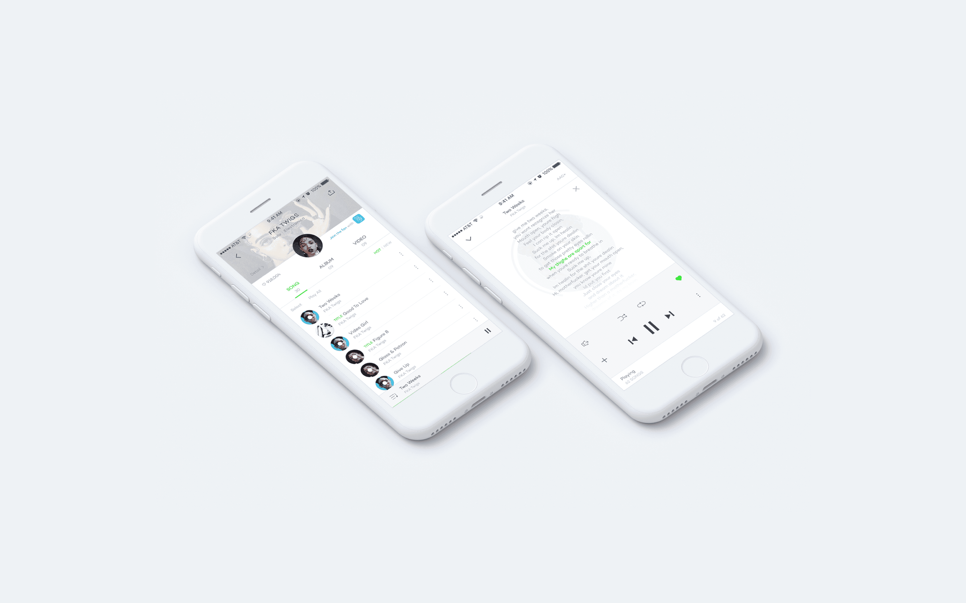


This redesign project focused on enhancing the UX and UI of Naver Music, a major streaming service in South Korea. While the local music streaming market is fragmented across multiple platforms, Naver Music had yet to clearly differentiate itself in terms of user experience and content strategy. To address this, the project targeted a redesign that emphasized personalized content discovery and introduced a new visual language inspired by CDs and album culture. The goal was to elevate both the emotional and aesthetic engagement of users in their 20s and 30s, Naver Music’s key demographic.
This redesign project focused on enhancing the UX and UI of Naver Music, a major streaming service in South Korea. While the local music streaming market is fragmented across multiple platforms, Naver Music had yet to clearly differentiate itself in terms of user experience and content strategy. To address this, the project targeted a redesign that emphasized personalized content discovery and introduced a new visual language inspired by CDs and album culture. The goal was to elevate both the emotional and aesthetic engagement of users in their 20s and 30s, Naver Music’s key demographic.
This redesign project focused on enhancing the UX and UI of Naver Music, a major streaming service in South Korea. While the local music streaming market is fragmented across multiple platforms, Naver Music had yet to clearly differentiate itself in terms of user experience and content strategy. To address this, the project targeted a redesign that emphasized personalized content discovery and introduced a new visual language inspired by CDs and album culture. The goal was to elevate both the emotional and aesthetic engagement of users in their 20s and 30s, Naver Music’s key demographic.
Contextual & Taste-Based Personalization
Contextual & Taste-Based Personalization
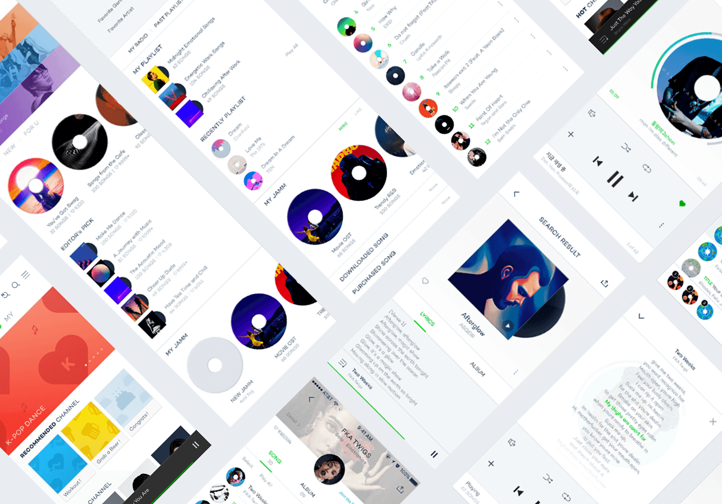
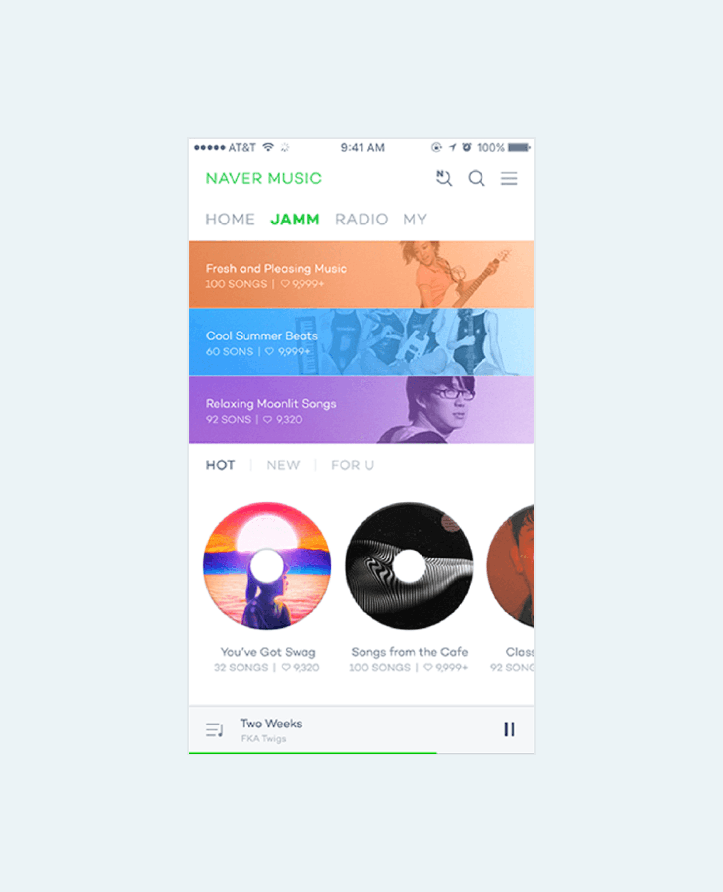
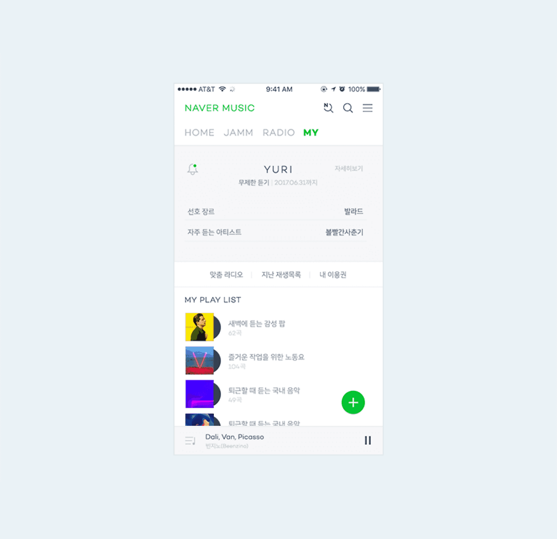
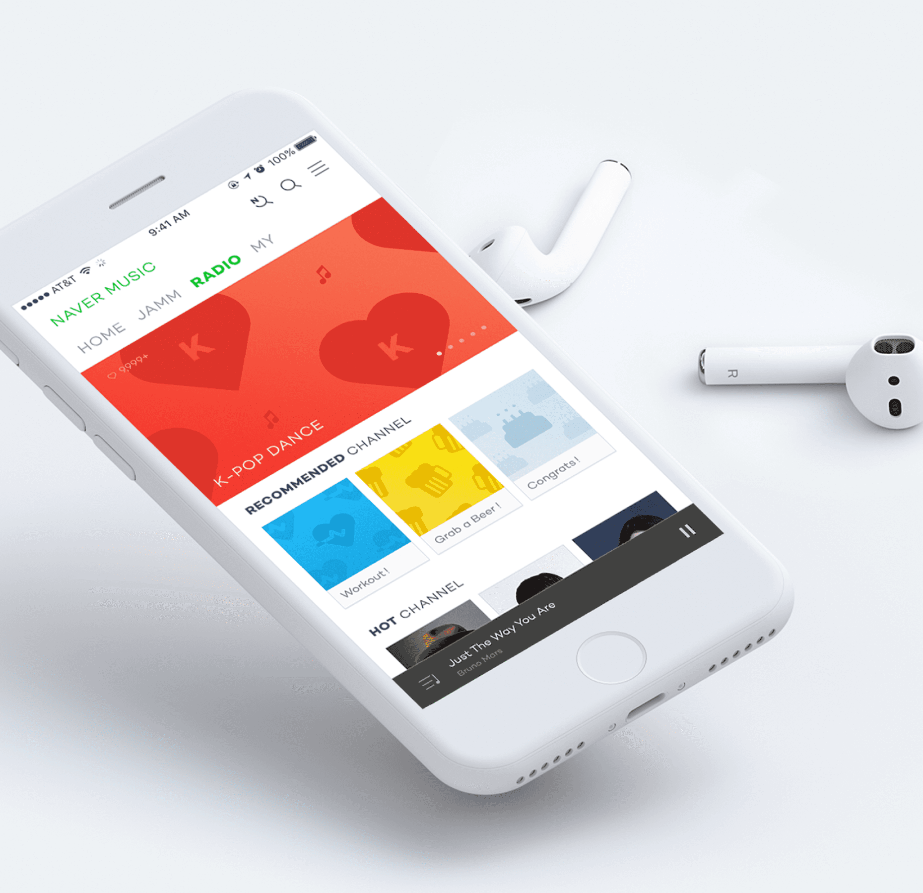
Research was conducted with Korean users in their 20s and 30s who actively use domestic music streaming platforms. The insights revealed a clear preference for personalized music recommendations that go beyond simply showcasing what’s popular. Users were more drawn to playlists that reflected their moods, routines, or listening context such as time of day, season, or previous listening patterns. Based on these findings, the main feed experience was restructured around theme-based recommendation blocks. These curated sections were designed to adapt to changing contexts and user preferences, creating a more dynamic and emotionally resonant streaming experience. By centering the UX around relevance and discovery, the platform encourages deeper, more personal connections to music.
Research was conducted with Korean users in their 20s and 30s who actively use domestic music streaming platforms. The insights revealed a clear preference for personalized music recommendations that go beyond simply showcasing what’s popular. Users were more drawn to playlists that reflected their moods, routines, or listening context such as time of day, season, or previous listening patterns. Based on these findings, the main feed experience was restructured around theme-based recommendation blocks. These curated sections were designed to adapt to changing contexts and user preferences, creating a more dynamic and emotionally resonant streaming experience. By centering the UX around relevance and discovery, the platform encourages deeper, more personal connections to music.
Reimagining the GUI with Album-Inspired Visuals
Reimagining the GUI with Album-Inspired Visuals
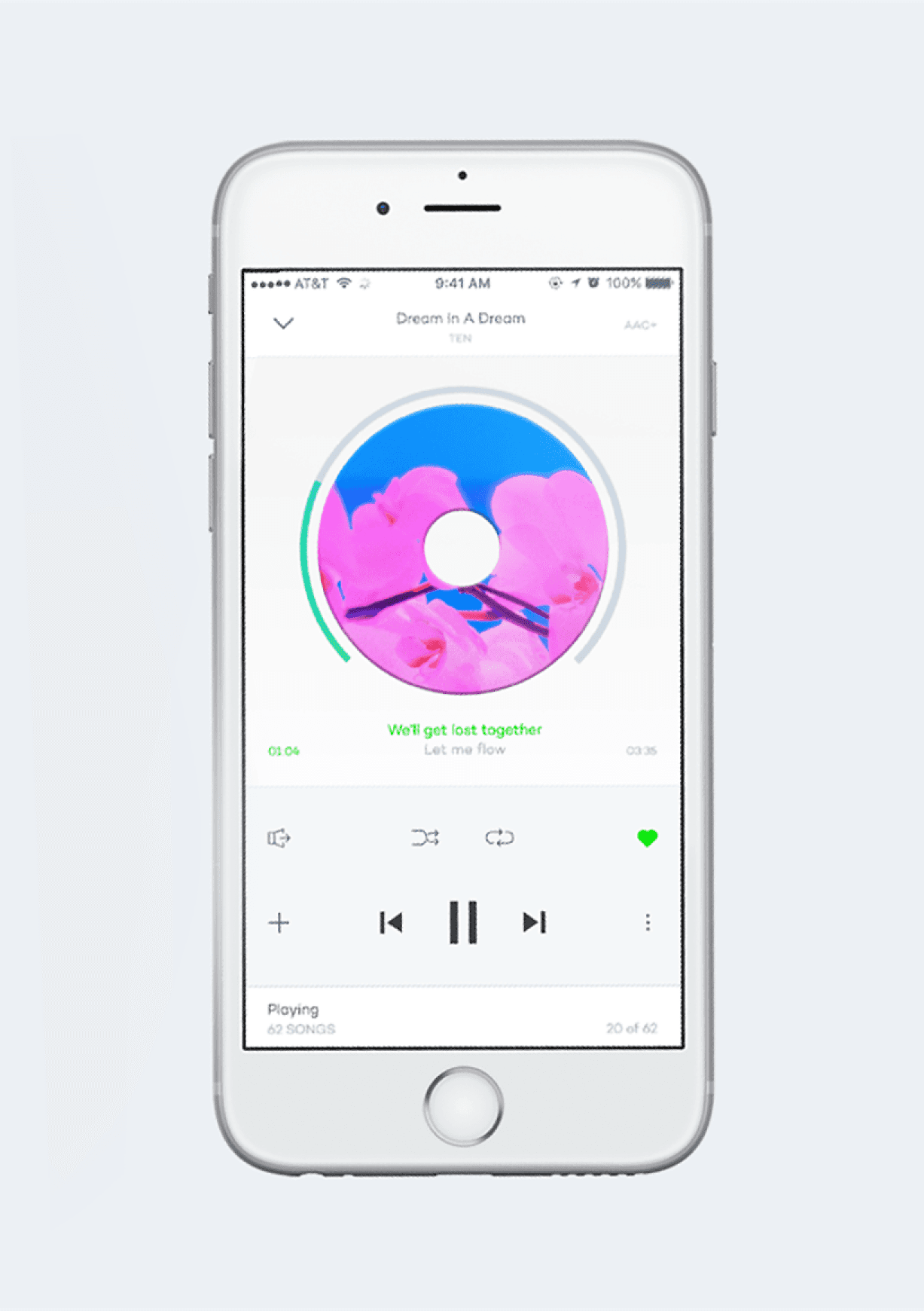
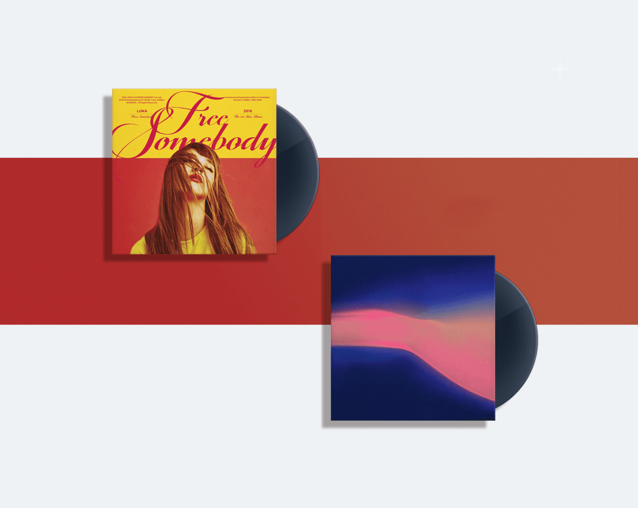
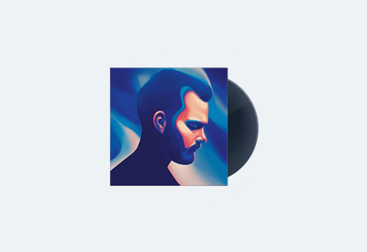
To visually distinguish Naver Music from competitors and enhance the joy of browsing, the GUI was reimagined using CDs and album covers as a core visual motif. While physical albums are now rare, they still evoke a strong sense of nostalgia and intentionality in how people experience music. This motif was applied through visual metaphors, animated transitions, and layout principles that echo the tactile pleasure of flipping through albums. The UI tone was further refined by simplifying layouts and streamlining interactions. This approach maintained both clarity and visual balance, while reinforcing the concept of “Play” not just as sound, but as a visual and interactive experience. Users are invited to enjoy navigating the app itself, mirroring the emotional engagement they feel while listening to music.
To visually distinguish Naver Music from competitors and enhance the joy of browsing, the GUI was reimagined using CDs and album covers as a core visual motif. While physical albums are now rare, they still evoke a strong sense of nostalgia and intentionality in how people experience music. This motif was applied through visual metaphors, animated transitions, and layout principles that echo the tactile pleasure of flipping through albums. The UI tone was further refined by simplifying layouts and streamlining interactions. This approach maintained both clarity and visual balance, while reinforcing the concept of “Play” not just as sound, but as a visual and interactive experience. Users are invited to enjoy navigating the app itself, mirroring the emotional engagement they feel while listening to music.

A


B

C
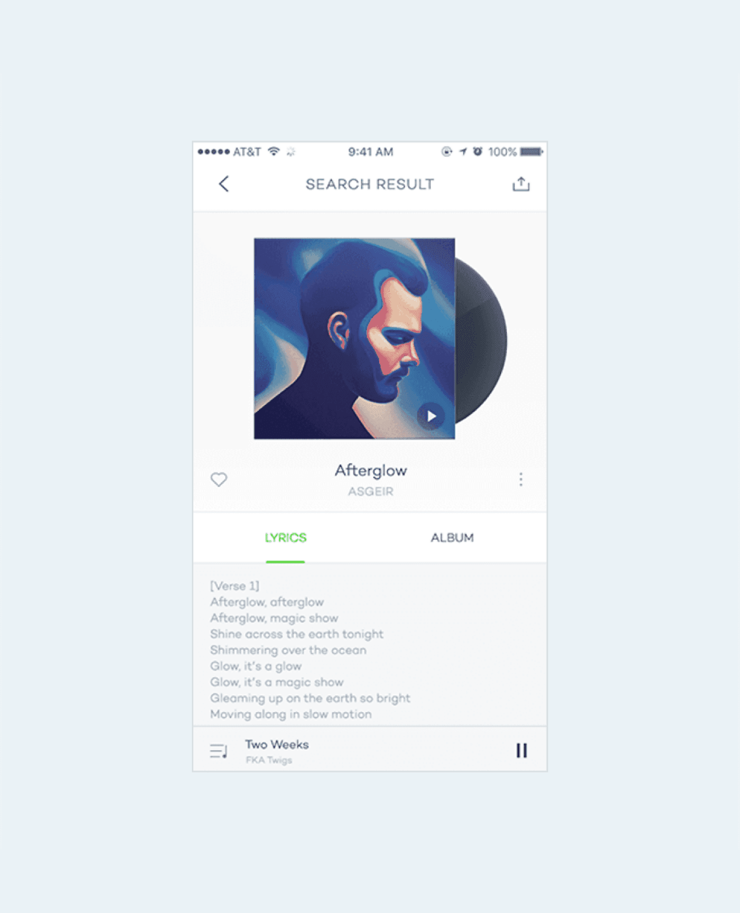
D
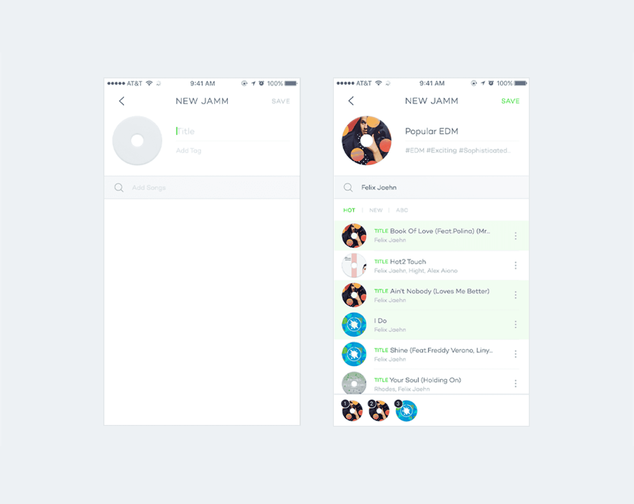
E
F

G

H
I

G

K

A
Searching for music
B
App icon
C
A part of wireframes
D
Searching result
E
Creating a Jamm
F
Jamm
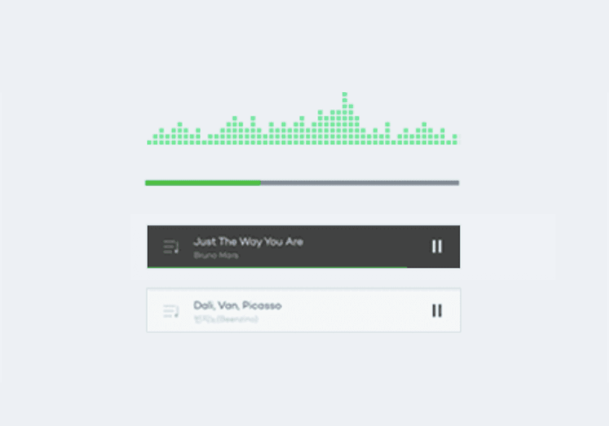
G
Playing music
H
My Naver Music
I
Radio
J
Design Components
K
Colors


